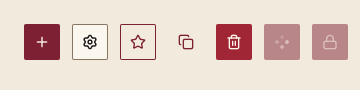

022 IconButton 图标按钮
用途
只显示图标的方形按钮,用于工具栏与紧凑操作。操作名称必填,供辅助技术朗读,并作为默认提示文字。建立在 Button 之上。
最小示例
if input.IconButton(c, icons.Must("settings"), "Settings", input.IconButtonOptions{Variant: input.Ghost}).Clicked() {
	fmt.Println("open settings")
}签名:func IconButton(c *ui.Context, icon *ui.SVG, label string, opts IconButtonOptions) *ui.Element
参数
| 字段 | 类型 | 默认值 | 含义 |
|---|---|---|---|
icon | *ui.SVG | 必填 | 图标;为 nil 时 panic。 |
label | string | 必填 | 操作名称;为空时 panic。 |
Variant | ButtonVariant | Primary | 与 Button 相同的五种变体;工具栏通常用 Ghost。 |
Tooltip | string | 操作名称 | 悬停约 600 毫秒后显示的提示。 |
Loading | bool | false | 显示加载标记并阻止点击。 |
Disabled | bool | false | 禁用。 |
状态
同 Button:悬停、按下、聚焦、加载、禁用。边长等于当前密度的控件高度,不小于 28 DIP。
事件
Clicked(),一次操作一次。
键盘操作
Tab 聚焦;Enter 或 Space 触发。
限制
- 禁用时不显示提示:MyGo 的
Hovered对禁用元素返回 false,提示随之不出现;名称仍作为无障碍描述保留。